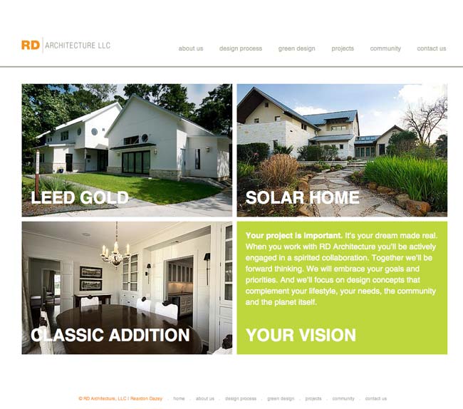
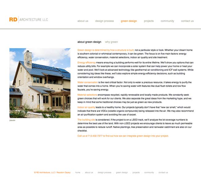
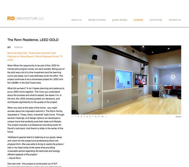
Web site for architecture firm. I designed the logo for the company first and let the colors from that inform what I used in the site to highlight navigation and copy. The home page highlights key projects by the firm. Most subsequent pages have slideshows highlighting different aspects of the company such as green design and the design process.
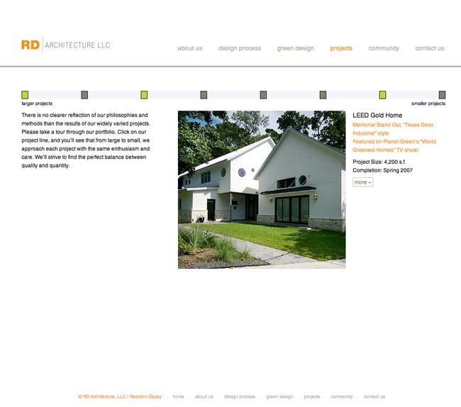
The projects page presents work on a scale from larger to smaller projects. jQuery spaces out the rectangles representing projects evenly regardless of the amount of work in that bar. On an individual project page, details of art versus science are explained while a slideshow runs to present the house itself.
